Bec
Turning a modest cottage into a light-filled family home
Location: Victoria, Australia
Project tasks: Inner-city renovation
Project size: 3 bedrooms
Booken Blend Resource: Booken Workshop
Photography: Lisa Booth, Booken Blend
Bigger isn’t always better.
Bec’s renovation in Victoria is a shining example of how sustainable design principles can transform a modest space into a comfortable, light-filled home.
If you’ve ever lived in a dark, pokey home, you will likely understand Bec’s obsession with all things light and bright.
And even though this reno is one of the loveliest, sunniest transformations I have ever seen, the thing that blows my socks off is how Bec and her hubby stayed aligned to their values throughout a long and sometimes challenging renovation process.
Anyone who has been through a build or reno will likely know how easy it is to get pulled into a world of bigger-is-better and keeping up with the Joneses, and Bec will tell you she isn’t immune to this.
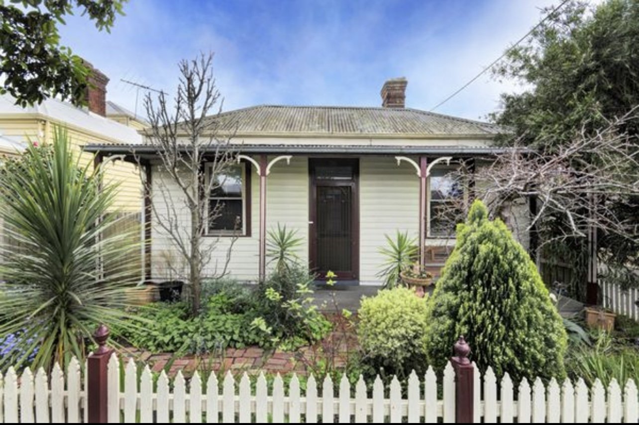
When Bec and her hubby first purchased their humble 10.5-square-foot cottage in a beautiful leafy street, they planned to turn it into a warm, light-filled, comfortable home for them and their two children, aged 17 and 14.
However, after a lengthy design process, Bec was left at the end scratching her head when she found herself with a magnificent set of floor plans… that they quickly discovered didn’t come within cooee of their budget (sound familiar?).


They were faced with a choice; go further into debt, give up on the dream, or scale it back.
Now, this is the uncomfortable and often stressful point of a build or reno where many of us are forced to wrestle with our ‘why’. What’s our motivation for building? Who are we renovating for? How do we want to live in our new home? Is this the best thing for our family?
Back in the beginning, after purchasing their cute (but kina ugly) cottage, Bec instantly began dreaming about having a sunny spot to sit and read the paper on a Sunday morning. She wanted a warm and inviting space for her children and their friends to come and go from, AND they quickly fell love in love with their location (it even allowed them to be a one-car family).
However, Bec had NEVER dreamed of a large, grand, or on-trend reno… ever.
So it was back to the drawing board.
We whipped out the graph paper and began playing around with how they could make better use of the space they already had.
It quickly became apparent that it might be possible to tick off the majority of their ‘wants and needs’ by applying simple, passive design to their existing 10.5 squares and save themselves an absolute motza in the process (if you want to know more about applying these principles to your own home download our free Sustainable Build Checklist).
So what did they do?
They decided to minimise their mortgage and reno the existing space, and here’s how they did it:
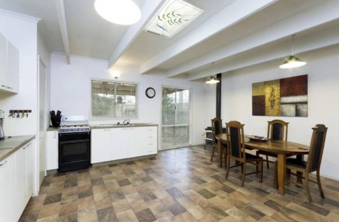
Bec was fortunate to have a well-orientated north-facing backyard (it’s part of the reason they purchased the property), so they opened up the rear of the home to capture the north sun using large glass floor-to-ceiling French doors and windows.
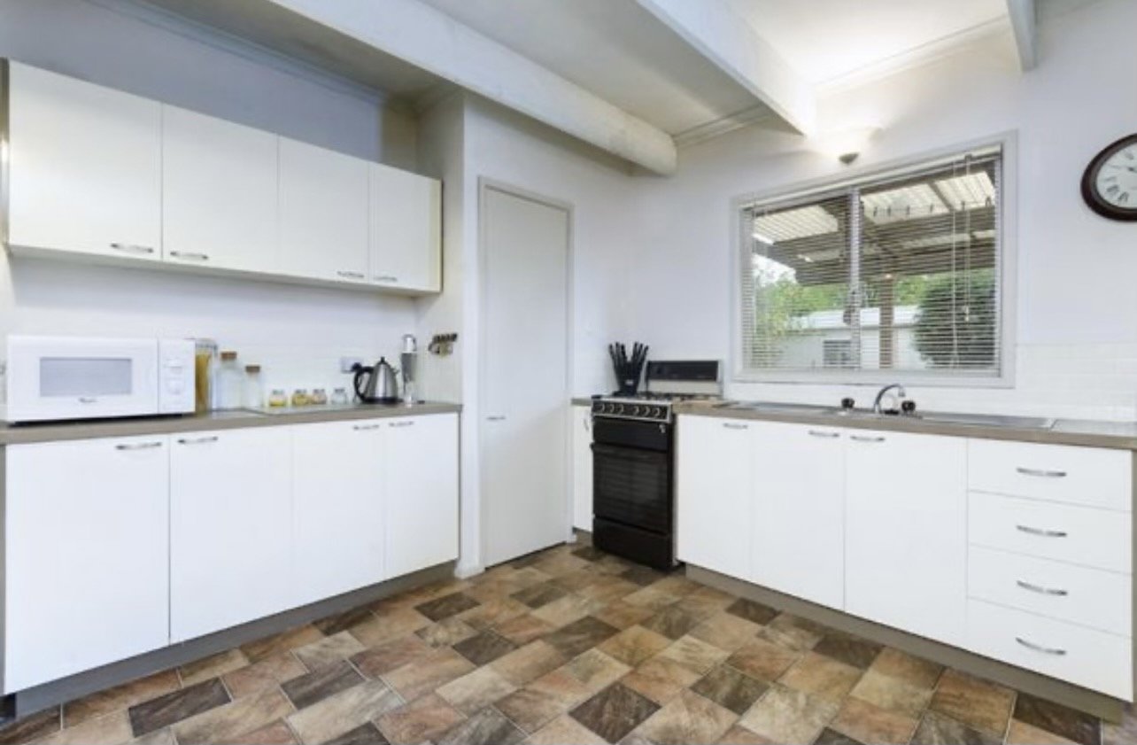
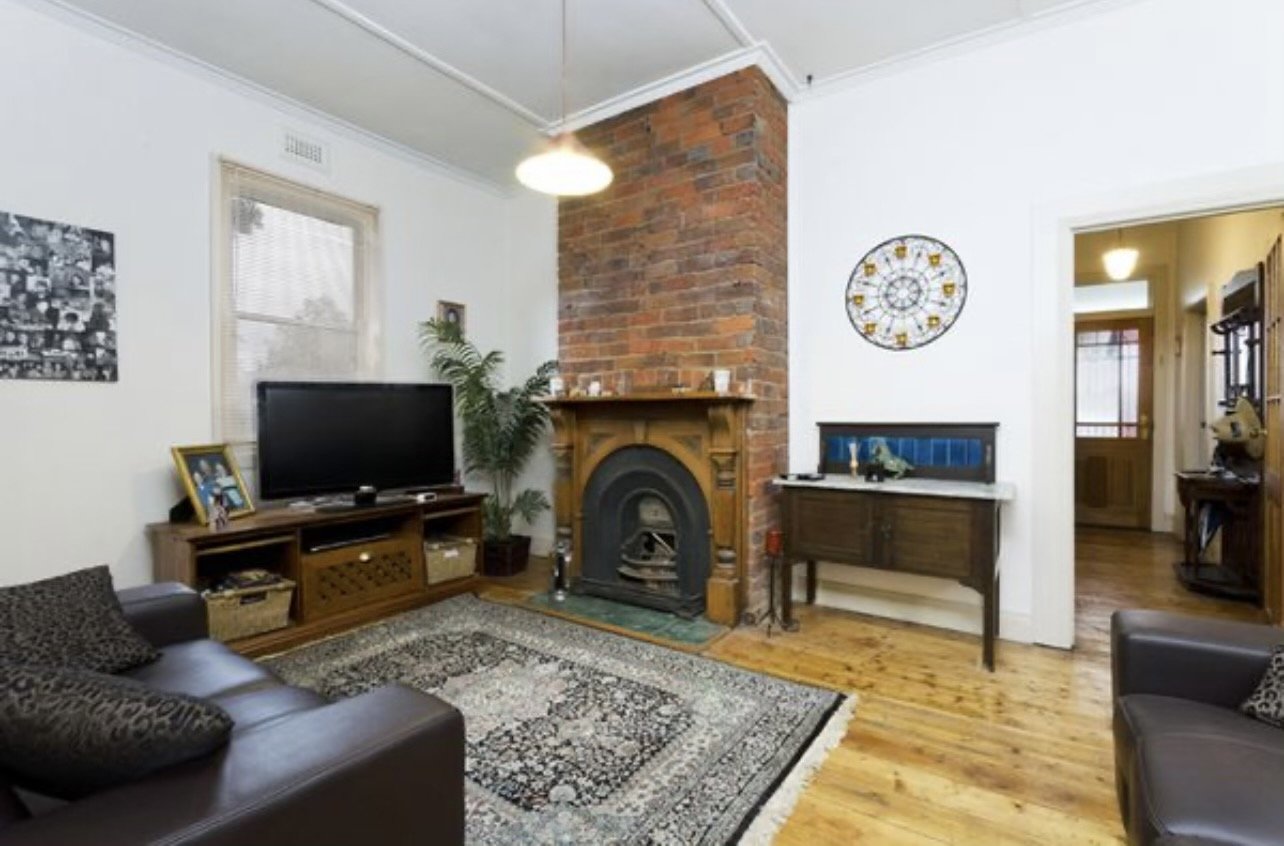
The wall between the kitchen and lounge was completely removed.
Windows were double glazed.
Everything was painted white!
An old electric storage hot water service cupboard was removed to make way for a spacious new combined bathroom and laundry.
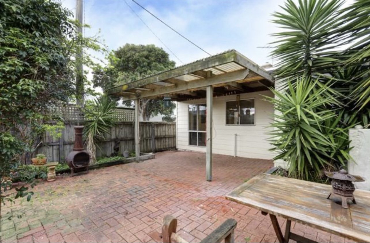
An ‘outdoor room’ was created; a combined alfresco/second living area that provides a space to sneak off to or gather in when needed.
Exterior walls were maxed out with insulation.
Quality window furnishings were added.
Solar was installed (their energy bill was reduced to a quarter).
They grew a vine over the north-facing glazing that loses its leaves in winter and shades them in summer.
And perhaps, their most important design decision - they located the outdoor room off to the side of the new north-facing living area so the covered area DOES NOT shade the north glazing in winter (which would have squashed Bec’s dream of a sunny, warm kitchen!).
Before
Before

-
"This home now perfectly reflects its owners."
It’s warm and sunny, not too fussy, and beautiful in a simple, cosy way. It also reflects Bec and her hubby’s commitment to leaving the planet in better shape for their children and their ability to shrug off the modern world’s expectations about what success and happiness should look like.
When I asked them recently if they were happy with their decision to forgo the fancy-pants (*code for bloody expensive) extension, they said they would be lying if they didn’t occasionally wish for a bit more space; however, the financial freedom and joy their little white cottage brings their family far outweighs any negatives.
Highlights
Highlights
-
North Light
Large French doors and windows capture abundant north sunlight.
-
Open Plan
Removed walls between kitchen and lounge for an open feel.
-
Double Glazing
Windows were upgraded to double-glazed for better insulation.
-
Outdoor Room
Added a versatile alfresco area for additional living space.
-
Solar Power
Installed solar panels significantly reduce energy costs.
-
Smart Insulation
Increased insulation in exterior walls to enhance energy efficiency.

Like what you see? Let’s work together
Ready to get serious about designing your own affordable, planet-friendly home? Our simple Sustainable Build Workshops teach you exactly how to design or renovate a low-impact home - in ANY style or location, without breaking the bank.


