Behind the Scenes of a White Weatherboard Flip House, ‘Ethelbrook’
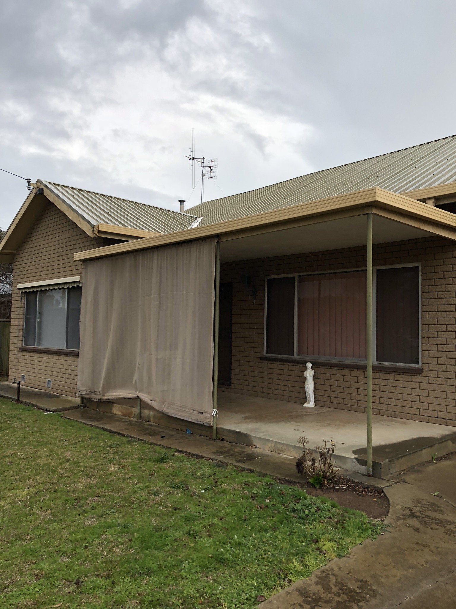
Just look at ‘Ethelbrook’ being a big old show-off, proving even when you are a west-facing, faux-brick ugly duckling on an urban block it’s possible to be brought back to life with hard work and simple passive design principles.
Yes, that is the same house... truth!
We flipped 'Ethelbrook' a few years ago, I saw her hit the market in a beautiful leafy street in our little town and I instantly saw its potential for a sustainable reno.
We viewed it, put in an offer, and signed the deal, all within a few hours - funny how life can spin on a dime sometimes.
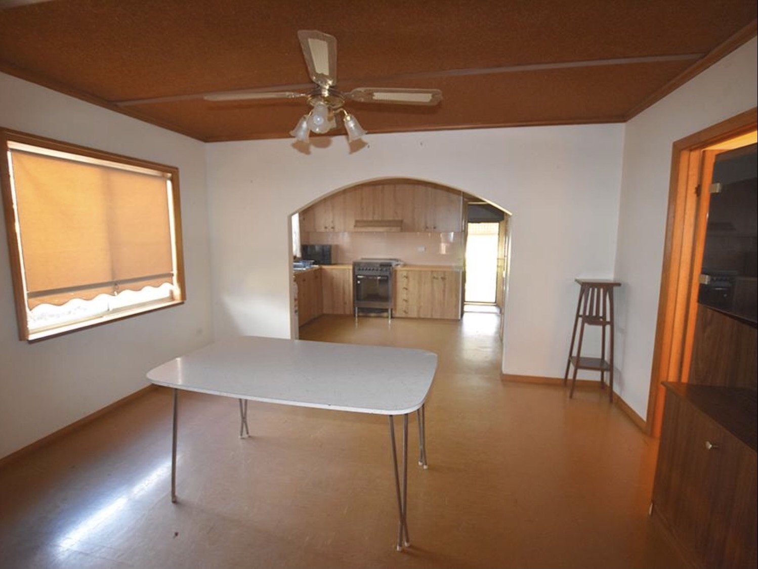
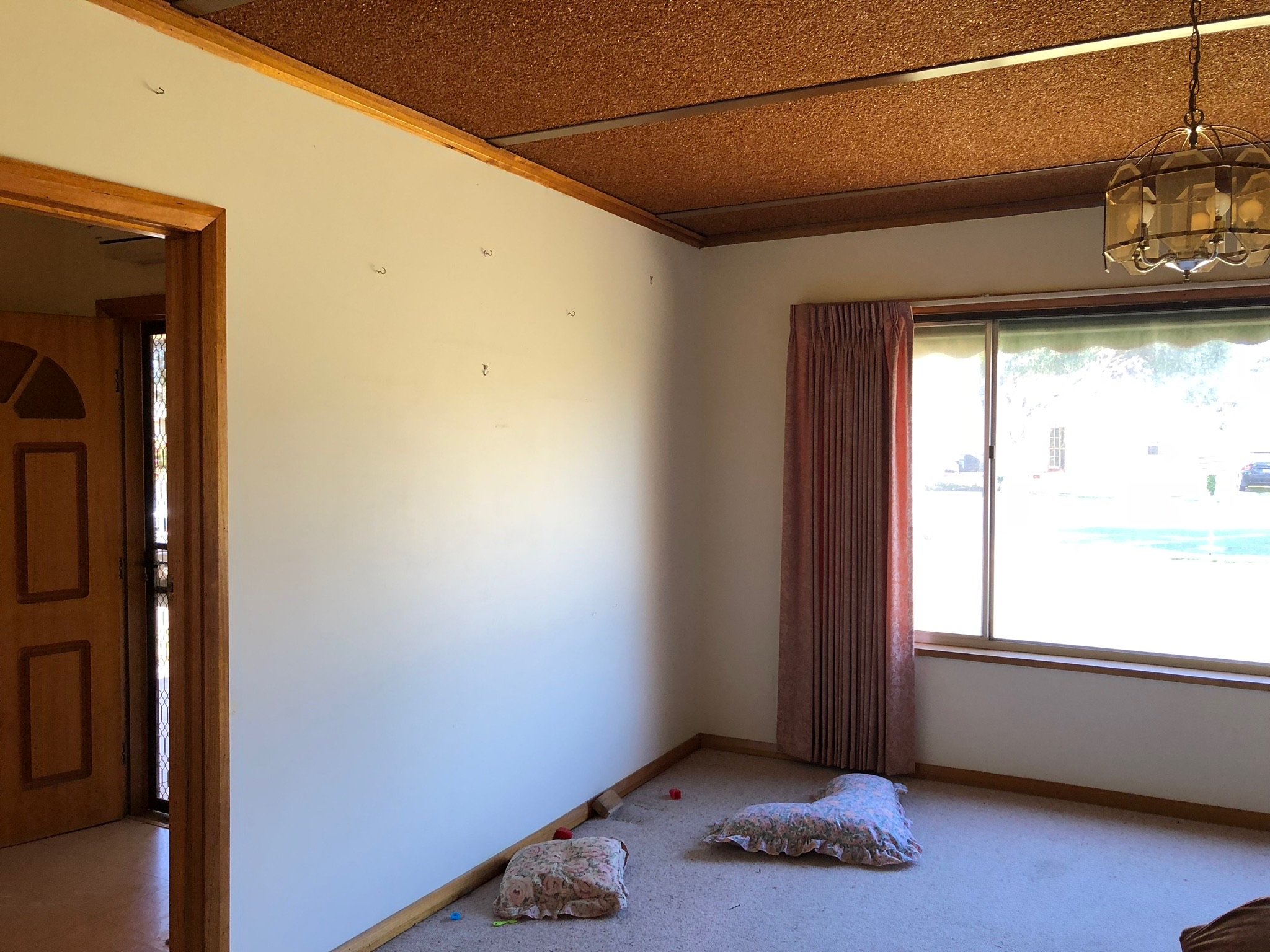
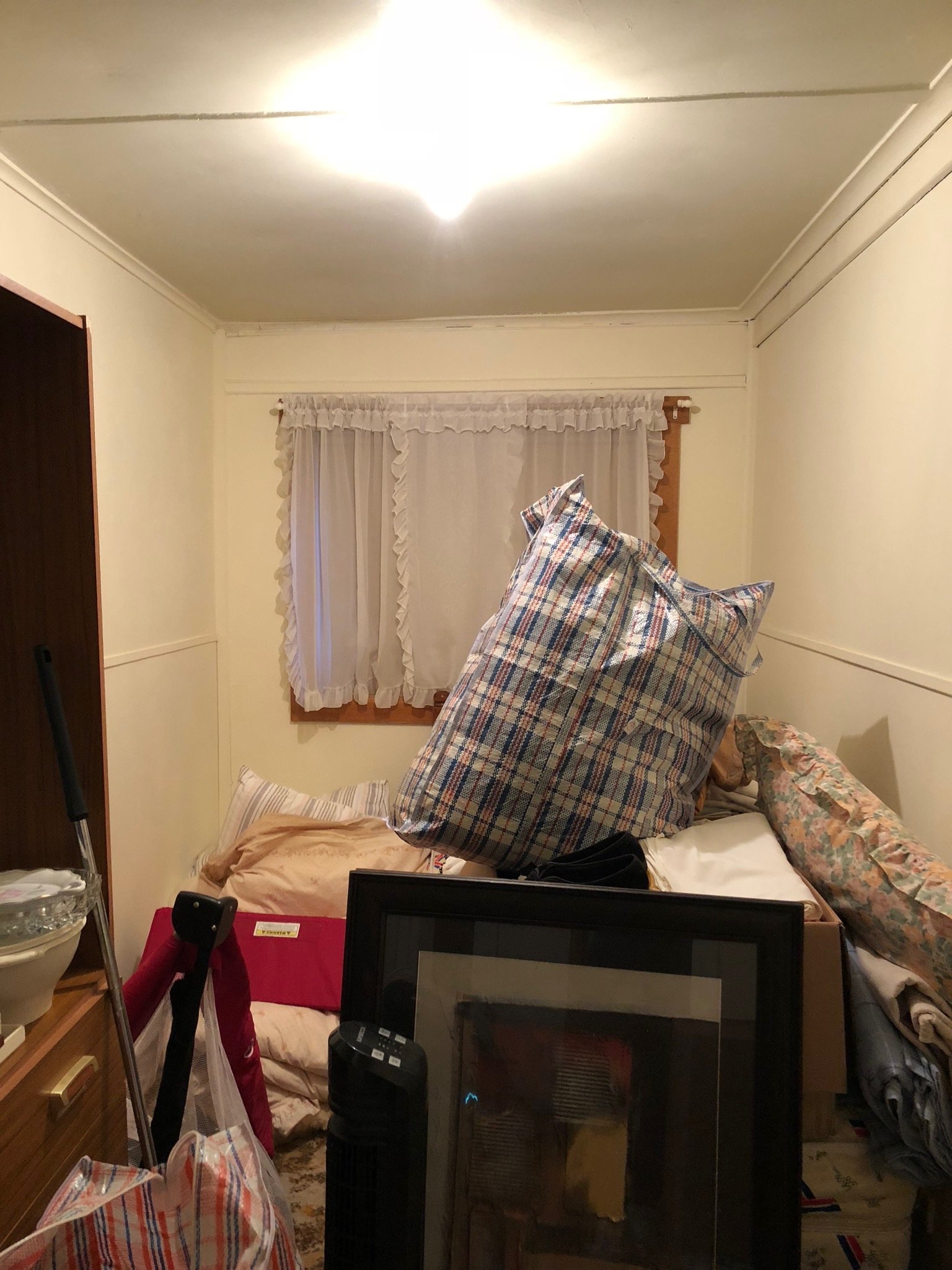
We then had the unenviable task of making the most of a poorly orientated block and a house consisting mostly of dark rabbit-warren spaces.
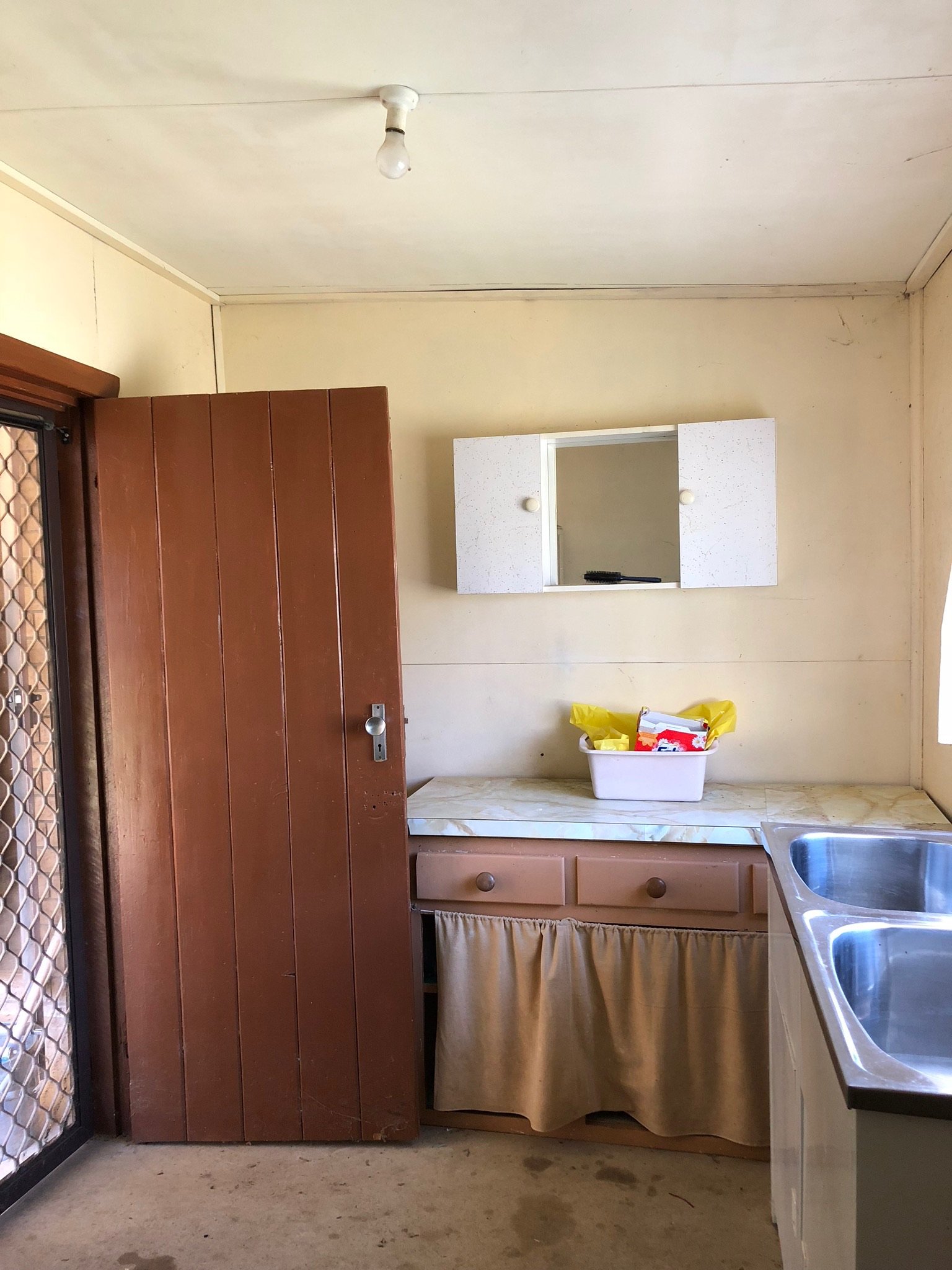
Here’s what we were working with…
But we knew what had to be done - this was not our first rodeo after all - so just like we had with Booken House and the renovations before that, we designed Ethelbrook to be the most comfortable, affordable, liveable version of itself for her future owner.
From the minute we opened the front door I imagined an airy, light, comfy home. I just knew in my bones it was possible for this house to FEEL this way if we stayed true to simple passive design principles.
So how did we achieve a light, bright, sustainable reno on a poorly orientated block?
We moved living areas to the north and bedrooms to the south - which meant flipping the entire floor plan
Incorporated north double glazing
Added an expanse of treated glazing to the west to connect indoors to outdoors and improve natural light
Gained access to the ceiling and all wall cavities to incorporate insulation and wrapping
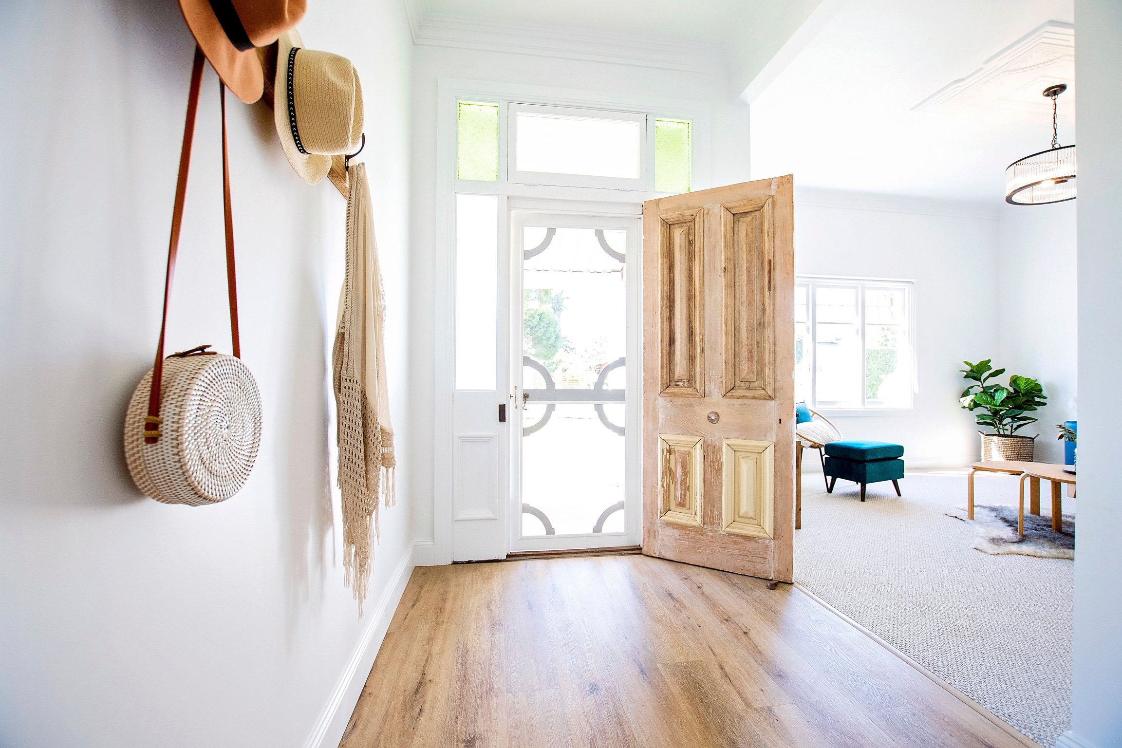
Used reclaimed materials - look at that barn door!
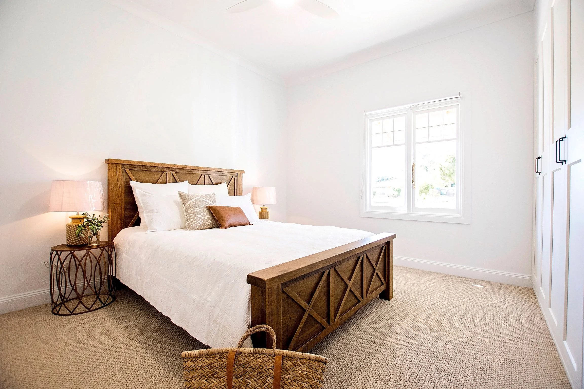
Incorporated combined spaces for cost-effective and efficient use of space, such as incorporating huge amounts of robe space into the master bedroom rather than a separate WIR.
To find out how to do this in your own reno or build download our free Sustainable Build Checklist or join us for a workshop.
Is it possible to fall in love with a hallway?
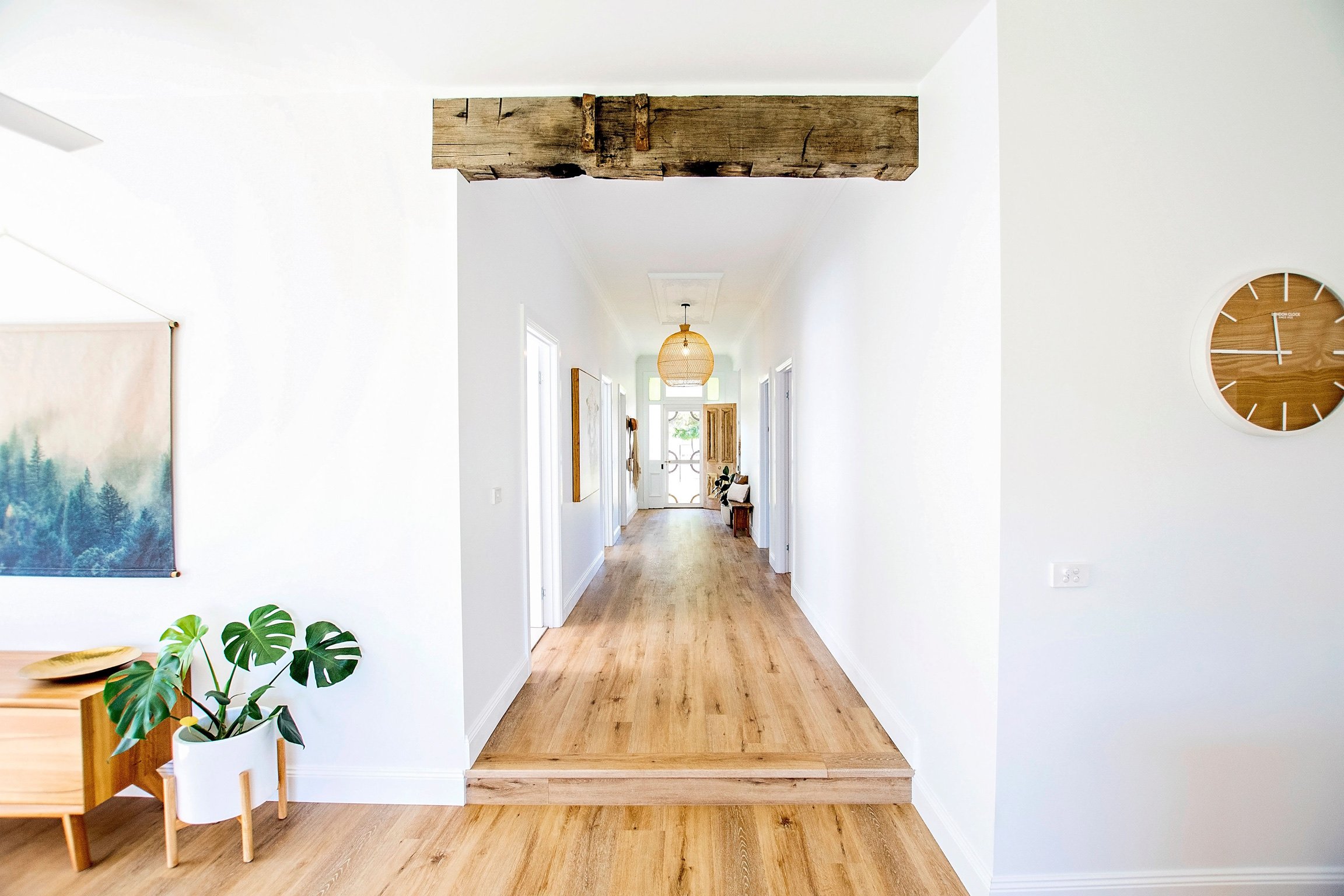
The first time I walked into Ethelbrook it was the hallway that whispered to me, I could picture a heritage flywire door and an open floorplan to create a path for cooling breezes to flow from front to back.
I could even hear the future screen door bang, just like it had at my grandma’s house.
These romantic notions may have been due to the fact the hallway was the only remaining room without a lowered false ceiling, and it retained the same gracious, wide, open feeling it has now.
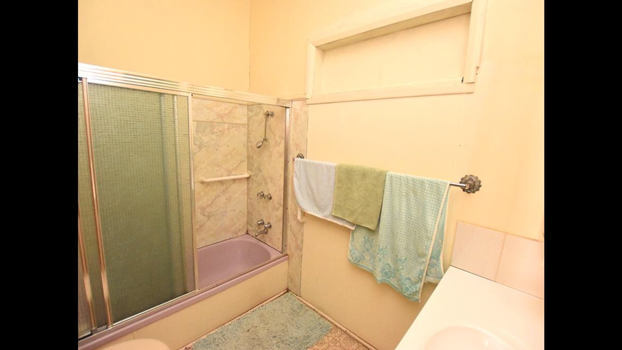
However, there was one small issue… it was only 4m long and ran smack bang into the bathroom!
Before
After
So we ripped out the old bathroom, and rebuilt the hall by incorporating a replica ceiling rose & cornice, and extended it front to back.
It now connects the entire home to the open-plan living area and the leafy yard beyond, and it remains my favourite space right to the end.
Flooring headaches
Finding the right flooring was tricky due to the irregular nature of the original floorboards and a complex transition into the open-plan living. After almost doing my head in (I had multiple spreadsheets dedicated just to flooring), we decided to go with a relatively new product at the time known as hybrid flooring.
It was pricier than laminate or vinyl plank, however, we liked the fact we could lay it ourselves, it had improved insulative properties (it has its own rubber backing which means it’s lovely under foot, quieter than most other floating floors and helps keep the cold at bay), and it came with a step option.
More importantly, it was kid-proof, dog-proof and general all-around life-proof (it can even be run into wet areas), which made it a better choice for us than engineered timber.
Can original features make or break a reno?
Sadly, there had been very few original features retained during well-meaning renos over the years (most likely completed in the 70s or 80s, need I say more?), so it was important to us to source and reinstate original features where possible - hello late night Ebay and gumtree trawls!
The day I found the original heritage front door and facade windows was a happy dance kind of day.
We also got asked a lot throughout the reno if the internal doors were original.
The answer is yes... but no.
There was one remaining original door in Ethelbrook when we took ownership. It was a lovely three-panel solid timber door true to the interwar Bungalow period Ethelbrook was built in. So we thought it would be a great idea to go out and source matching original doors for the remaining doorways.
This turned out to be an exceptional idea IN THEORY, however, in practice the hours of work stripping and painting these doors made me seriously question our sanity.
Sanity aside (I mean, sanity’s overrated right?), there is no questioning their beauty now.
Kitchen and ‘mess room’ love
The kitchen now resides on the south wall of the open plan living area and flows out to the ironbark deck, leafy backyard and alfresco area through large sliding floor-to-ceiling doors.
However, this calm light-filled space wasn’t always like this, it was once seven different rooms… yes seven.
Oh my, how I love knocking out a wall - or seven!
I still love the simple white shaker cabinetry, stone bench top and splashback, brushed brass tapware and burnished brass pendants. The cabinetry was built by a local cabinet maker, and we sourced stone from Bunnings.
With such a large open kitchen, why did we choose to tuck a tiny inconspicuous sink in the corner?
Surely that’s not practical?
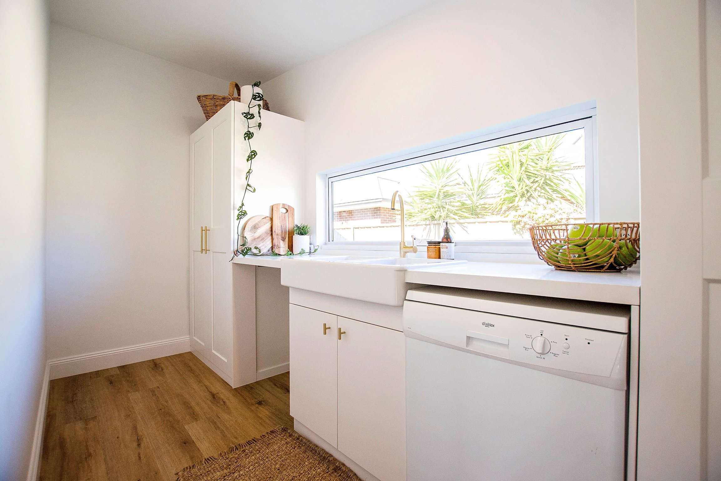
Wellllll... it’s because we built a WHOLE room behind the kitchen to hide the mess in - we absolutely love our Mess Room here at Booken House, so when it came to designing Ethelbrook we wanted to incorporate the same convenient concept.
The ‘Mess Room’ is a combined butler’s pantry and laundry and hides the dishwasher, washing machine, pantry and linen press.
But more importantly, it hides the mess!
This means visitors come to my home and think I’m a domestic goddess. No need to tell them the truth, let’s just keep this little piece of information between us, eh?
The little glass box
I can’t share the story of Ethelbrook without sharing the coolest, raise-the-hair-on-the-back-of-your-neck story.
When we originally purchased Ethelbrook it was a deceased estate and we had no knowledge of the previous owners.
During the demolition, we discovered a beautiful little glass box hidden away in the back of a cupboard with a handwritten note and printed wedding date. Something about the glass box intrigued me and I couldn’t bring myself to throw it away, so I kept moving it around to safe places throughout the renovation.
On the day of our first open for inspection, we were thrilled to discover a few extended family members of the original owners had come along to see the transformation of Ethelbrook.
During a conversation with some lovely matriarchs of the family, I remembered the glass box and went to retrieve it from its safe place. As I handed it to one of the ladies to see if she could shed some light on its origins, she looked up at me with shock and surprise, opened the glass lid and held up the little printed tag.
She whispered, “This is my wedding date.”
I nearly fell over!
Oh my Lordy, how pleased I was for the little glass box to find its rightful owner all these decades later.
How did Ethelbrook get her name?
On a long drive to Melbourne to source original heritage building materials, Boots was driving and I was (surprise, surprise) researching on my phone.
We were deep in the design phase at the time and were keen to know as much as possible about the history of Ethel.
We made contact with the local Historical Society and had been advised of whom the most likely original architect was, so I was reading aloud the info I found on the architect and got to a section about his wife, Ethel Brook.
Boots instantly pipes up, ‘I think we just found our name.’
Oh yes we did!
Was it all worth it?
The first thing I need to say here is an enormous thank you to our forgiving, supportive kids who held the fort whilst we threw ourselves into Ethelbrook.
This was one of the most challenging projects we have ever taken on and it wouldn’t have been possible without their help.
Boots and I both worked our ‘normal’ full-time jobs throughout the six-months it took to flip Ethelbrook, completing the vast majority of the work on weekends and after work whilst our teenage kids cooked dinner and looked after their little sister. They also pitched in with plenty of manual labour.
It was a long and arduous six months for this little Booken crew.
It also wouldn’t have been possible without our incredible builder, Leigh Huggard, and other local trades who are a pleasure to work with and make these crazy ideas come to life.
However, it wasn’t all lollipops and rainbows.
Towards the end of this project, we ran into some pretty sh*tty issues with a disgruntled ratepayer down the road who knew enough about the law to be able to use Council’s processes to cause lots of pain for unsuspecting locals wanting to improve their homes.
Let’s just say I lost a fair bit of sleep throughout this time and still feel burned by a process that, although out of our control, impacted us so directly.
In all honesty, knowing now how much hard work and sacrifice this project would take, I’m not sure I would take it on again.
However, they say ignorance is bliss and I’ll be forever grateful for the lessons learned, the opportunities created and the path it has led us down.
We did good team Booken.
For more info on how to apply sustainable design principles to your project, access our Design Packs and download your free Sustainable Build Checklist.
Ethelbrook Specs
Flooring: Hybrid Abode Prime in Chambery
Wall & ceiling colour: White on White
External colour: Snowy Mountain Quater
Trim colour: White on White Satin
Reclaimed timber bathroom vanities: Simon Wilson Furniture
Bathroom light-up mirrors: Highgrove Bathrooms
Brass tapware: Highgrove Bathrooms
Stone tops on vanities: Highgrove Bathrooms
Bathroom floor tiles: Beaumont Tiles
Bathroom wall tiles: Bunnings White
Artwork: Nic from North East Design
Furniture: Knights Homemakers Kyabram
Treated window: O’Sullivans Shepparton
Bathroom pendant: Freedom
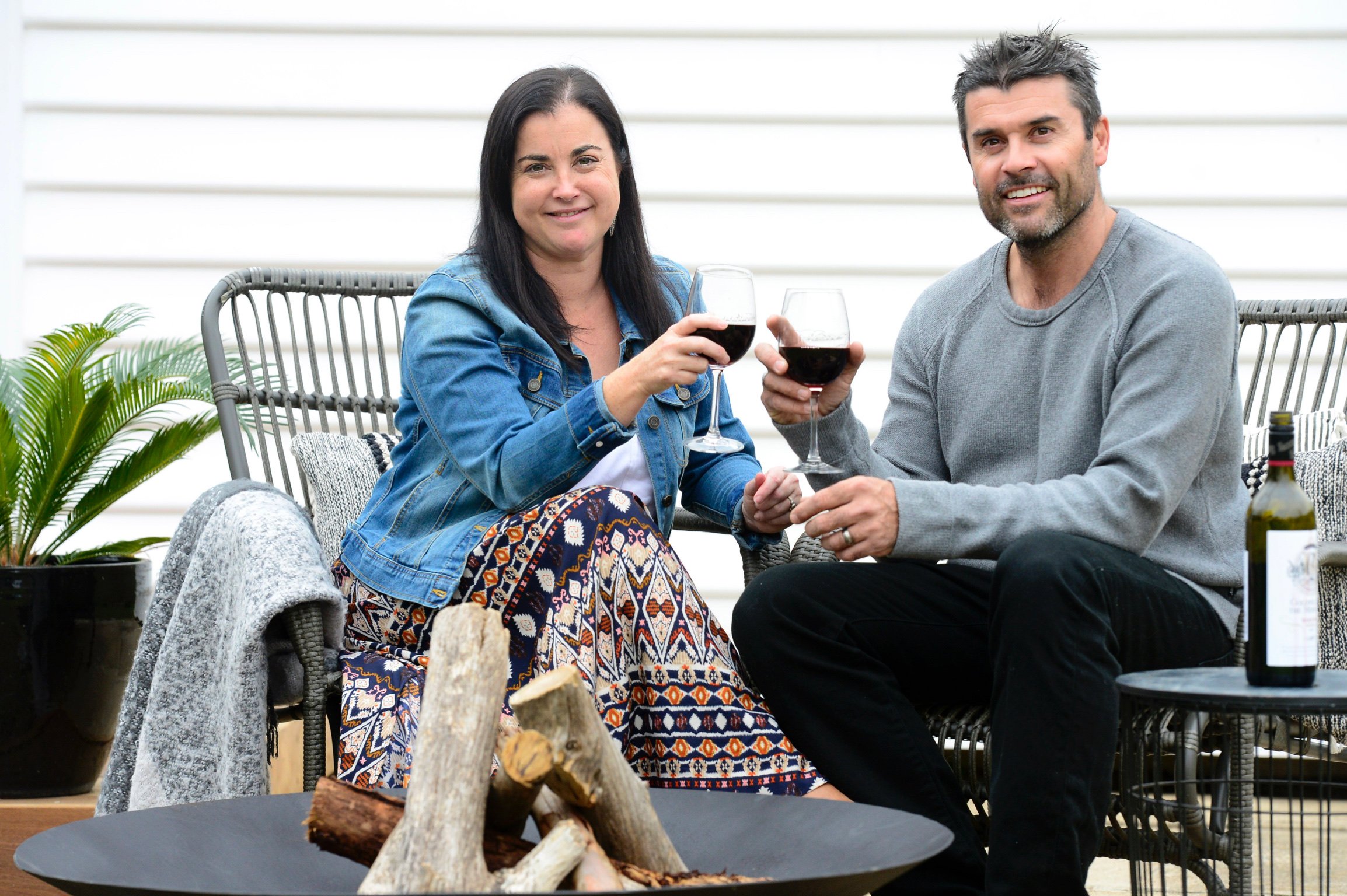
Firepit: Echuca Engineering - 1m wide, made of steel and painted pot belly black
Image by North East Design


